Component inputs
The inputs list is the part of the manifest file that describes all the inputs for the component. These eventually translate into component properties in the Studio. Inputs are for configuring the component on a page, for example the text that it should display or a data source tag it should monitor.
-
key
The logical name of the input, which will be used to provide the input value in the component code asthis.context.inputs.<key> -
type
The type of the input. See the input types overview below. -
label
The text to display in the component properties dialog above the input field. -
required
Indicates whether the field is a required field. -
defaultValue
An initial value to use for the field. -
description
An optional descriptive text to display along with the input field. The text can be formatted using Markdown. -
placeholder
The text to display in the component properties dialog in the input field if it has no value yet. -
disabled
Indicates whether the field should be rendered as a disabled input field. Defaults tofalse.
Input types
| Type | Presented in Studio as | Value type in context |
|---|---|---|
| String | Input field | string |
| Text | Textarea | string |
| RichText | Clickable textarea that triggers a text-editor which will allow rich text and plain text (markdown) | HTML (rich text) or string (plain text) |
| Number | Numeric input field | number |
| Checkbox | Checkbox | boolean |
| Selection | Dropdown list | string |
| MaterialIcon | Filterable list of material design icons | string |
| Icon (Deprecated) | Dropdown list containing info, warning and error | string |
| Color | Color picker | string |
| Image | Image file upload | string |
| File | File selector | File object |
| Date | Date picker | ISO 8601 timestamp or empty string |
| DateTime | Date & time picker | ISO 8601 timestamp or empty string |
| RawMetric | Dropdown list showing the tags of the selected agent | object with keys selector, decimals, unit, factor |
| AggregatedMetric | Dropdown list showing the tags of the selected agent and an aggregation formula | object with keys selector, decimals, unit, factor, aggregator, transform |
| LiveMetric | Dropdown list showing the variables of the selected agent | object with keys selector, decimals, unit, factor |
| Group * | Grouped combination of its children | object with the key values of its child inputs as keys |
| List * | List with Add and Remove | array |
Most types are pretty self-explanatory. Two input types are special (*), as they are of a structural kind.
String
The String type represents a single line of text.
The translate subfield can be used to toggle custom translation functionality. Defaults to true, which indicates that the input is intended to be translatable.
The pattern subfield can be used to add validation based on a regular expression. It is incompatible with translatable inputs. The patternHint subfield can contain a message that is displayed when the pattern does not match. Both fields are introduced with Component SDK 1.23.
{
  "key": "title",
  "type": "String",
  "label": "Title",
  "placeholder": "Enter title text",
  "translate": true
}
{
"key": "serial-number",
"type": "String",
"label": "Serial number",
"placeholder": "Enter a serial number",
"pattern": "[0-9][0-9][0-9]-[0-9][0-9][0-9][0-9]-[A-Z][A-Z][A-Z]",
"patternHint": "The serial number must be of the form 000-0000-AAA"
}Text
The Text type represents longer pieces of text, usually spanning multiple lines.
The translate subfield can be used to toggle custom translation functionality. Defaults to true, which indicates that the input is intended to be translatable.
The pattern subfield can be used to add validation based on a regular expression. It is incompatible with translatable inputs. The patternHint subfield can contain a message that is displayed when the pattern does not match. Both fields are introduced with Component SDK 1.23.
Depending on the component, you may use some markup language such as Markdown, but the input type itself does not specify nor dictate which syntax can be used.
{
  "key": "body",
  "type": "Text",
  "label": "Body",
  "placeholder": "Enter body text",
  "translate": true
}
{
"key": "sentence",
"type": "Text",
"label": "Sentence",
"placeholder": "Enter a single sentence",
"pattern": "^[A-Z][^.]+.$",
"patternHint": "Enter a single sentence that starts with a capital and ends with a period."
}RichText
The RichText type represents longer pieces of text, usually spanning multiple lines, with the output rendered in HTML.
The RichText type is designed for handling longer pieces of text, typically spanning multiple lines. It supports two output formats:
- HTML (Rich Text): The text is rendered with formatting, such as bold, italics, headings, and lists, allowing for visually enhanced content.
- String (Plain Text with Markdown): The text is rendered as a simple string that supports Markdown syntax, enabling basic formatting like headers, lists, and emphasis while remaining in plain text form.
This dual capability makes RichText versatile, accommodating both richly formatted content and Markdown-enhanced plain text as required.
The translate subfield can be used to toggle custom translation functionality. Defaults to true.
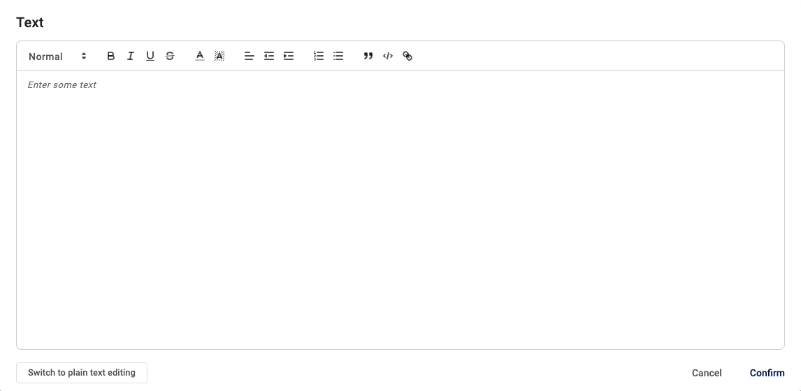
A screenshot of the rich text editor interface, which appears when clicking on the text area within the Studio platform.
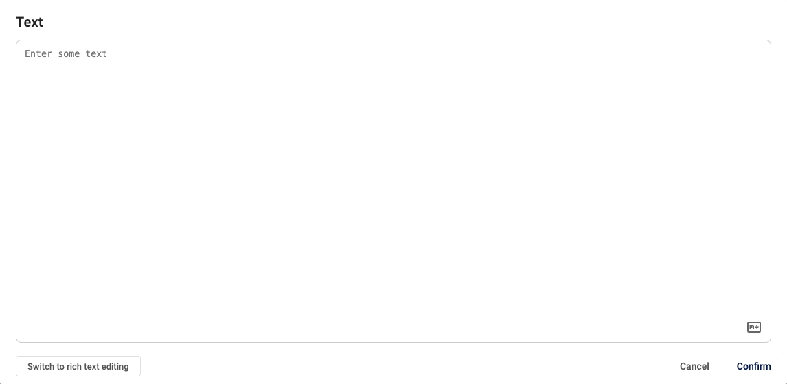
A screenshot of the plain text editor interface, which appears when switching from rich text to plain text
{
  "key": "body",
  "type": "RichText",
  "label": "Body",
  "placeholder": "Enter body text",
  "translate": true
}
Number
The Number type represents a number. It has three fields, all optional.
minandmaxspecify the bounds of the input value (inclusive).stepspecifies the increment between values when using the spinner buttons of the input.
{
  "key": "level",
  "type": "Number",
  "label": "Level",
  "min": 0,
  "max": 10,
  "step": 2,
  "defaultValue": 1,
  "required": true
}
Checkbox
The Checkbox type represents a single true/false option, visualized as a checkbox.
{
  "key": "showLegend",
  "type": "Checkbox",
  "label": "Show legend",
  "defaultValue": true
}
Selection
The Selection type represents a single selection out of multiple options, visualized as a dropdown list. Two label fields are available to describe each option, label and shortLabel. Depending on the space available the UI will use either. The selected option is provided by the $-prefixed field that can be used in a Group's summary (see below for usage).
{
  "key": "objectFit",
  "type": "Selection",
  "label": "Object fit",
  "options": [
    { "value": "cover", "shortLabel": "Cover", "label": "Cover entire box (maintains aspect ratio)" },
    {
      "value": "contain",
      "shortLabel": "Contained",
      "label": "Contained in box (maintains aspect ratio)"
    },
    { "value": "fill", "shortLabel": "Fill", "label": "Fill (stretch to fit)" },
    { "value": "scale-down", "shortLabel": "Scale", "label": "Scale down (maintains aspect ratio)" },
    { "value": "none", "shortLabel": "None", "label": "None" }
  ],
  "defaultValue": "cover"
}
MaterialIcon
The MaterialIcon type represents a string that can be used to identify an official Google Material Design icon.
{
  "key": "icon",
  "label": "Icon",
  "type": "MaterialIcon"
},
Icon
The Icon type represents a string with the value info, warning or error. It can be used to display an icon of that type. Deprecated: use MaterialIcon instead.
Color
The Color type represents a string that can be used to identify a color in hexadecimal format.
{
  "key": "color",
  "label": "Color",
  "type": "Color",
  "defaultValue": "#FF0000",
},
Image
The Image type represents a URL for an uploaded image file that can be used as a source to display that image.
{
  "key": "image",
  "label": "Image",
  "type": "Image"
},
File
The File type represents a JavaScript File object. Note: this type is only supported in dialogs.
context.openFormDialog({
  title: 'File selection',
  inputs: [
    {
      key: 'file',
      type: 'File',
      label: 'File',
    },
  ],
}).then(result => {
  if (result) {
    console.log(result.file.name);
  }
});
For multiple file uploads set multiple: true it will return an array of JavaScript File objects.
context.openFormDialog({
  title: 'File selection',
  inputs: [
    {
      key: 'files',
      type: 'File',
      label: 'File',
      multiple: true,
    },
  ],
}).then(result => {
  if (result) {
    console.log(result.files.map(file => file.name).join(', ');
  }
});
Date
The Date type represents a date. The user selects a date. The stored value will be a full ISO 8601 timestamp with time at midnight in the local time zone of the user, converted to UTC.
For example: a user in New York (ET, UTC-05) chooses the date 2023-12-20, it will be stored as 2023-12-20T05:00:00Z. For a user in Amsterdam (CET, UTC+01), this would have been stored as 2023-12-19T23:00:00Z.
{
  "key": "date",
  "label": "Date",
  "type": "Date",
  "defaultValue": "2023-12-20T00:00:00Z"
}
DateTime
Introduced in Component SDK 1.22
The DateTime type represents a date with a time (hours and minutes). Users will select a date and a time in their own local timezone, after which it will be stored as an ISO 8601 timestamp, converted to UTC.
{
  "key": "datetime",
  "label": "Date and time",
  "type": "DateTime",
  "defaultValue": "2023-12-20T12:31:00Z"
}
RawMetric
The RawMetric type represents the specification of a request for raw logging data from the historical data database.
The allowedTypes subfield specifies which types of metric values are allowed in this input. The field is an array, with one or more of the following string values: "bool", "int", "float", "str". Note: If the subfield is not specified, or has value null or [], then all types are considered allowed.
{
  "key": "metric",
  "label": "Raw metric",
  "type": "RawMetric",
  "allowedTypes": ["int", "float"]
}
AggregatedMetric
The AggregatedMetric type represents the specification of a request for aggregated logging data from the historical data database. For more information about the aggregators, please refer to this section.
The allowedTypes subfield specifies which types of metric values are allowed in this input. The field is an array, with one or more of the following string values: "bool", "int", "float", "str". Note: If the subfield is not specified, or has value null or [], then all types are considered allowed.
{
  "key": "metric",
  "label": "Aggregated metric",
  "type": "AggregatedMetric",
  "allowedTypes": []
}
LiveMetric
The LiveMetric type represents the specification of a request for live logging data directly from the router. This will automatically create a websocket connection.
The allowedTypes subfield specifies which types of metric values are allowed in this input. The field is an array, with one or more of the following string values: "bool", "int", "float", "str". Note: If the subfield is not specified, or has value null or [], then all types are considered allowed.
{
  "key": "temperature",
  "label": "Temperature",
  "type": "LiveMetric",
  "allowedTypes": ["str"]
}
Group
Groups let components structurally combine multiple configurable inputs. For example to configure a graph for a data variable and a line pattern. It is particularly useful in combination with a List type, such that a Page manager can multiple graph lines, each with their own data variable and line pattern.
A Group can have two appearances, expanded and summarized. In the expanded mode, all child inputs are shown at the same level as the group. In summary mode, child inputs are shown in a dialog window.
-
children
The requiredchildrenfield specifies the inputs in the group. -
summary
The optionalsummaryfield specifies how a group should be summarized. It has two subfields,labelandcolorField. Thelabelfield contains a Mustache template string, with the tags referring to the text values of the child inputs. The optionalcolorFieldfield specifies which child input should be used to color the summary. Some input types provide$-prefixed fields that provide extra information on the field or its value.
{
  "key": "graphLine",
  "type": "Group",
  "label": "Graph Line",
  "summary": {
    "label": "{{name}} {{$operator.shortLabel}}",
    "colorField": "alternate"
  },
  "children": [
    { "key": "name", "type": "String", "label": "Name" },
    { "key": "color", "type": "Color", "label": "Color" },
    { "key": "alternate", "type": "Color", "label": "Alternate color" },
    {
      "key": "metric",
      "type": "RawMetric",
      "label": "Data Metric"
    },
    {
      "key": "operator",
      "type": "Selection",
      "options": [
        { "value": "eq", "shortLabel": "=", "label": "Equals (=)" },
        { "value": "ne", "shortLabel": "≠", "label": "Not equals (≠)" }
      ]
    }
  ]
}
List
Lists allow components to offer a dynamic number of configurable inputs. For example to show a dynamic list of device properties that is configurable by a Page manager.
The required itemType field specifies the type of items in the list.
{
  "key": "properties",
  "type": "List",
  "label": "Device Properties",
  "itemType": {
    "key": "property",
    "type": "Text",
    "label": "Device property",
    "placeholder": "Enter the device property name"
  }
}
Updated 5 months ago